Redesigning a local restaurant's website to support increased takeout sales

Introduction
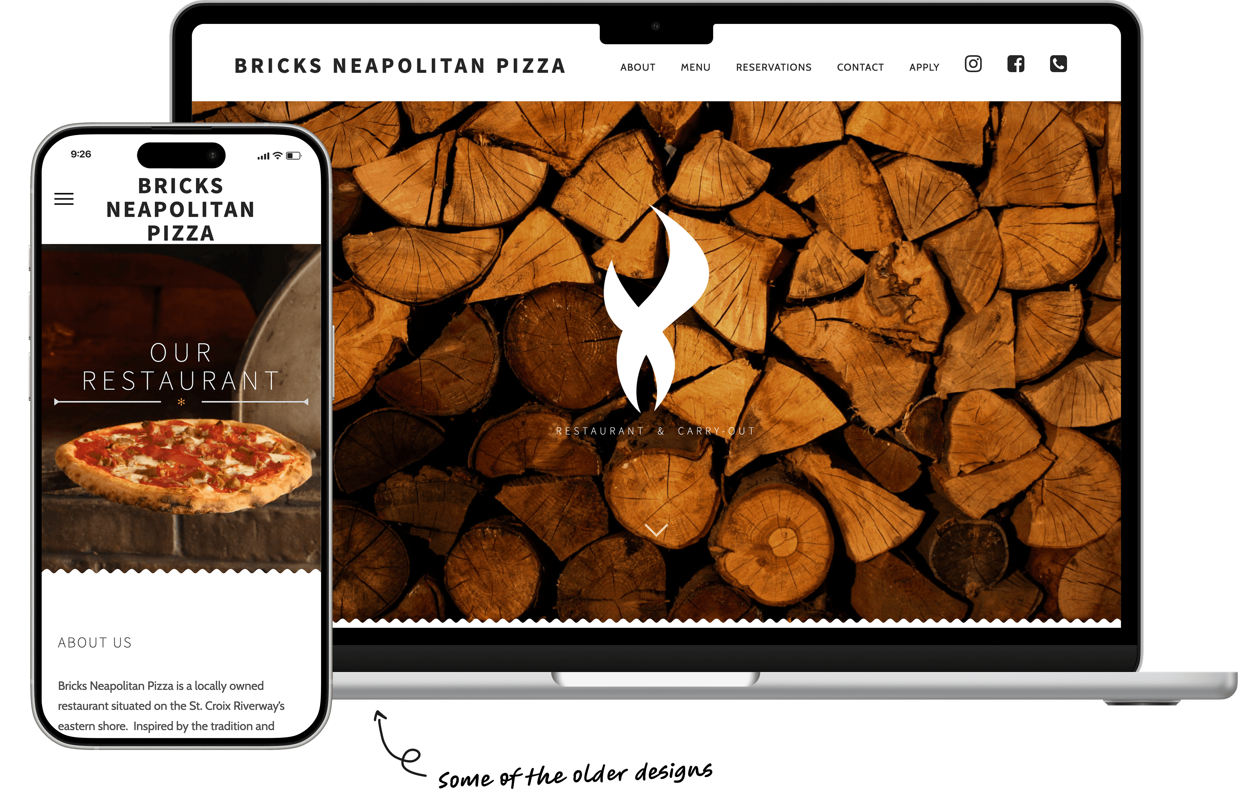
Redesigning one of my very first web projects
Bricks Neapolitan Pizza is a local chef-owned restaurant that I’ve served at for several years. I also handle the restaurant’s design needs, including the website.
I created the restaurant’s current website in 2016 using WordPress. Since then, I’ve grown a ton as a designer (and honestly cringe a little bit at some of my original choices!).
I’m now redesigning the website to align with my current understanding of UX and web design, with a focus on the mobile user experience.
Project Team
Just me (designer and developer) working one-on-one with the business owner/manager.
Business Problem
The original design didn’t provide the best experience for customers interested in placing a to-go order or planning a visit to the restaurant.
Jump to Design Solutions
Design Goals
My history with the business made getting buy-in easy, but we still aligned on clear goals that would guide the redesign.
Since I had an existing relationship with Bricks Neapolitan Pizza and its owners, I didn't have to sell the idea of a redesign as hard as I might have any other client.
We still felt it important to talk about and align on some initial design goals. This step helped us agree on a scope of work and prioritize the features most important to both the business and end-user experience.
Update the visual design
We wanted to breathe some new life into the business’ brand using updated colors, typography, and photography.
Fix usability and accessibility issues
The old design had some color contrast and semantic HTML issues that we wanted to eliminate in the new design.
Improve food menu navigation
Takeout orders increased significantly during/after COVID-19, with the website being the most accessible and up-to-date way for customers to view the restaurant’s menu.

Formative Research
I turned to free research methods to inform my design and set benchmarks for future comparisons without breaking the budget.
Due to the nature of this project, my research budget was pretty non-existent. I figured out several ways to collect data for free using sources like existing customer feedback, Google Analytics, and an online survey I made available on the existing website.
This research strategy wasn't super slick or glamorous but still allowed me to pull out key insights that informed my design approach. It also gave me a benchmark which I'll compare the new design to in the future.
Customer Service Feedback
Restaurant staff hear it all, including candid customer feedback about the website. I combined my own observations (as a server) with those of other staff members to understand the website experience from the standpoint of a real user.
Web Analytics
I learned how to set up and monitor Google Analytics so that we could start collecting data about the website and its visitors' habits. I started collecting this data in October 2023 and continue to monitor it today.
Heat Maps
In looking for ways to supplement the data gathered from Google Analytics, I came across HotJar. Though no super impactful insights came from this data, it did come in handy when I needed to confirm user behaviors I was seeing in other data sources.
User Surveys
I created a short survey with questions about user goals and satisfaction. This survey was live for several weeks and captured qualitative and quantitative data from site visitors in real-time (i.e., when they were actively using the Bricks website).
Research Insights
My early research efforts revealed some unexpected patterns in user goals and behavior.
77%
of website visitors are using a mobile device
Responsive design is a must-have for any website today, but this statistic told me that my resources would be much better spent focusing on the mobile experience and adapting the design to fit desktop.
90%
of visitors navigate straight to the food menu
The fact that almost all site visitors went straight to the food menu confirmed our prioritization of this page and its role in the average user's experience. If any page deserved the bulk of my attention, it was this one!
64%
of visitors come to the website for the weekly feature menu
The survey revealed that a majority of users came to the website in search of the restaurant's weekly feature menu. This data caused us to re-evaluate our priorities and explore ways to incorporate the feature menu into the new design.
Design Solutions
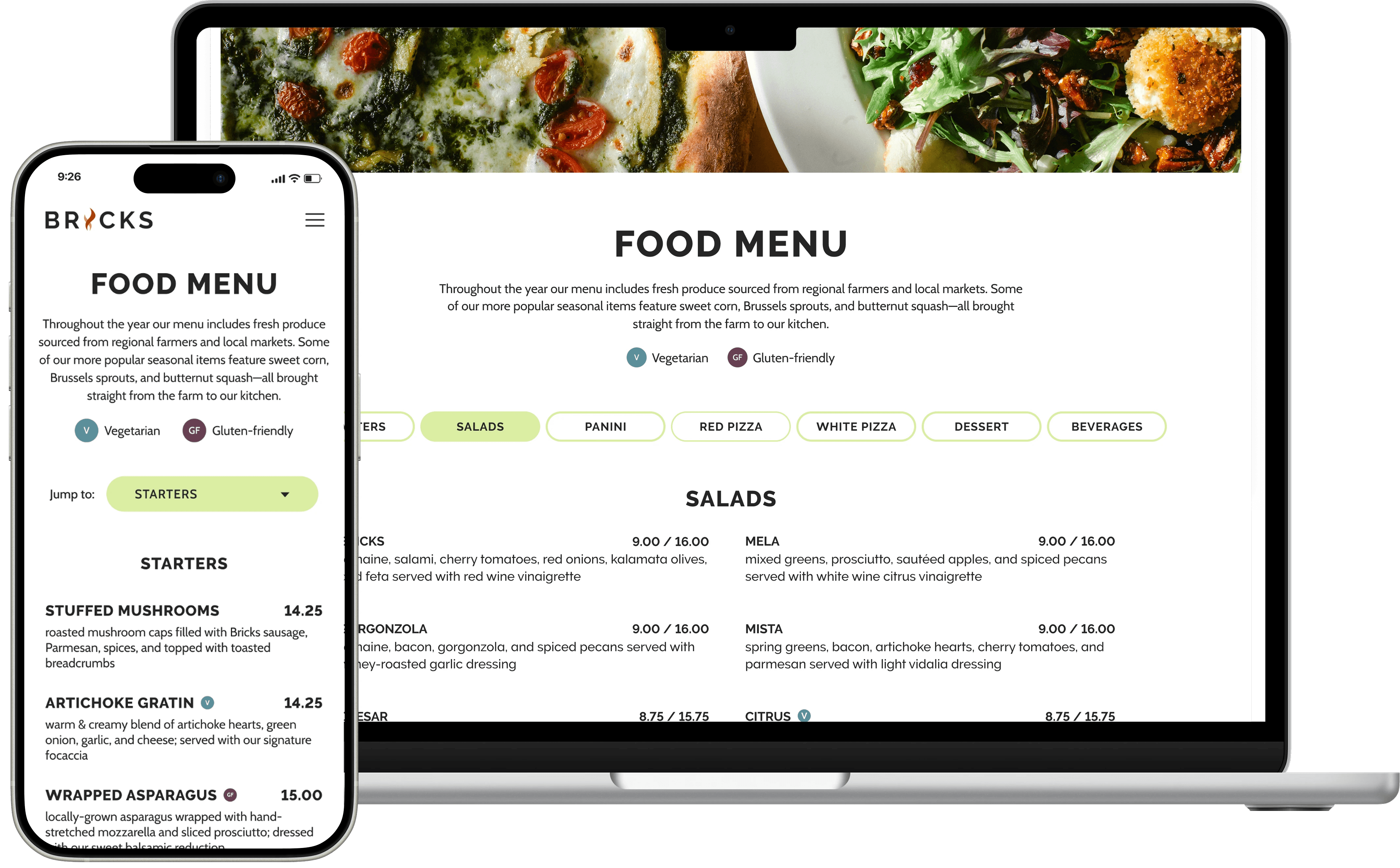
Seeing an opportunity to boost the average user's experience, I transformed the static food menu with responsive navigation and user-focused microinteractions.
The new food menu design took shape across many different iterations, starting with lo-fi ideation and ending with a full-fledged prototype. I prioritized the mobile experience throughout this process, adapting my designs to desktop as needed.
Iteration #1
A food menu that is easier to navigate on the go
Problem: The original menu was designed as one very, very long page. The experience was particularly rough on mobile, where the menu collapsed into a single column layout.
Solution: Breaking the food menu into smaller sections that can be navigated using buttons/tabs.
Before

After
Iteration #2
Custom components for different viewports
Problem: Tabs make great use of the horizontal space on desktop but pose usability issues on mobile (e.g., requiring horizontal scrolling to view all navigation options).
Solution: A responsive design that switches from tabs to a dropdown selector depending on the device width.
Iteration #3
Microinteractions that help orient the user
Problem: Some users might still prefer to scroll through the menu, making the tab/dropdown navigation redundant or confusing.
Solution: As the user scrolls through the menu, the navigation remains at the top of the screen and updates to show the section currently in view. Users can seamlessly switch from one navigation method to the other.

Gathering User FeedBack
I took a lean approach to user testing—starting small and scaling only as needed—to uncover insights that otherwise may have been overlooked.
I had very limited resources to conduct any user testing. My strategy was to start with the minimum number of participants and only add more research as needed. This approach was inspired by Jakob Nielsen's 5-User Rule, which suggests that you only need 5 research participants to uncover up to 85% of usability issues.
While not statistically perfect, I feel this was a good solution for this particular project because the alternative likely would have been no research at all.
1
Users were given a mid-fidelity prototype of the mobile website and asked to complete a number of common tasks.
2
Testing supported most of my initial design solutions! But we did learn that some information was not where users expected it to be.
3
I put together a brief card sorting activity and sent it to a few dozen representative users to aid in finalizing the site map.
Project Status
My redesign is currently in development!
After launch, I’ll continue collecting data from user surveys and web analytics that I can benchmark against the original design. While I hope this data supports my design choices, I'm also prepared to continue iterating if I uncover any new concerns.
Project takeaways
Every business can benefit from UX design.
I've seen a lot of discourse (mostly in online UX spaces) about how a smaller, marketing project like this isn't really UX. While a lot of this project does fall into that bucket, there was a huge opportunity to improve the user experience and support more to-go sales by applying UX principles to the food menu navigation.
Being deeply embedded in a project is a double-edged sword.
There were obviously tons of benefits to being so close to this project! I had direct access to stakeholders, end users, and even had a unique perspective on the development hand-off since I was the one handling it all.
However, I also found that being so close to this project sometimes stumped me. I was hesitant to propose more 'out there' solutions for fear of steering the business in the wrong direction. I had their full trust, but without a mentor or more senior designer to guide me, I had to rely fully on myself to answer questions and provide critique and redirection when it mattered.
Good UI is sometimes essential to sell good UX.
Nothing stopped me from keeping the old site's visual design and just updating the navigation and information architecture for a better user experience. But that wasn't what the business owners were excited about. Wrapping the UX improvements up in a shiny new UI meant stakeholders could see a more tangible output from their investment in me and my expertise.
